I started building Isostate while rebuilding the PURISTA website.
PURISTA has a simple idea at its core, but it touches a lot of moving parts: services, commands, subscriptions, runtime adapters, deployment shapes, message flow, and the line between business logic and infrastructure. A static diagram can show that once. It is much harder to show how the idea builds up step by step.
That was the itch.
I wanted a way to explain complex relations visually, without turning the website into a custom animation project. I wanted something as approachable as Mermaid, but less technical in how it feels on a page. Something that can sit inside a product website, an article, a documentation page, or a presentation and still look like it belongs there.
Isometric visuals are useful for that. They are familiar, dimensional, and a good eye-catcher. More importantly, they make system relationships feel spatial. A service can sit next to a database. A route can move across a floor. A boundary can become visible. A deployment can grow instead of just appearing as a finished block diagram.
The Problem with Flat Diagrams
I like Mermaid. It is practical, text-based, reviewable, and fast. For architecture notes and technical articles, that is hard to beat.
But for a product page, Mermaid often feels too raw. It explains structure, but it rarely creates a visual moment. And when the topic is complex, one diagram quickly becomes overloaded:
- every component is visible at once
- every relation competes for attention
- every arrow looks equally important
- the reader has to understand the final state before understanding the journey
That is not how I wanted the PURISTA site to explain architecture.
I wanted to say: first there is a capability. Then a command. Then a runtime adapter. Then the deployment shape changes. The story matters as much as the final diagram.
The Shape I Wanted
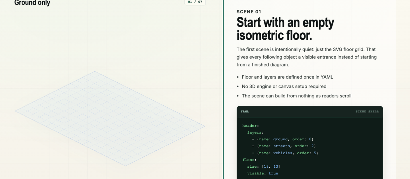
The goal was not a full 3D engine. I did not want canvas setup, camera math, a game loop, or a heavy runtime just to explain a backend concept.
The goal was closer to this:
- Write a small scene file.
- Compile it at build time.
- Embed the output in a static website.
- Drive it with scroll progress, buttons, a timeline, or presentation controls.
That is the core idea of Isostate. Scenes are written as .isostate.yaml, compiled into browser-ready SVG runtime data, and then mounted in the page.
The browser does not parse YAML. The expensive and error-prone part happens before deployment.
import { mountScene, type RuntimeBundle } from '@sebastianwessel/isostate';
import sceneBundle from './scene.isostate.js';

const target = document.querySelector<HTMLElement>('#scene');
if (!target) throw new Error('Missing #scene');

const mounted = mountScene(target, sceneBundle as RuntimeBundle, {
  label: 'Infrastructure scene',
  controller: false,
});

mounted.engine.setProgress(0.5);
That is intentionally boring application code. The page owns the interaction. Isostate owns the scene rendering.
YAML, Because It Should Stay Reviewable
The scene source should be readable in a pull request. That was important to me.
I did not want a visual editor that stores opaque state. I wanted a file that feels like configuration: assets, layers, floor settings, elements, connections, and scene changes.
header:
  assetBaseUrl: ./assets
  assets:
    - id: service-box
      path: service-box
  floor:
    layer: structures
  layers:
    - name: structures

scenes:
  - id: initial
    elements:
      - id: api
        asset: service-box
        layer: structures
        at: [1, 1]

  - id: scaled
    update:
      elements:
        - id: api
          at: [2, 1]
          size: 2
The first scene is the placement snapshot. Later scenes are deltas. That keeps the authoring model small: add something, update something, remove something.
It also makes the mental model friendly. You do not animate everything manually. You describe how the scene changes, and the runtime interpolates between those states.
Connections Are Part of the Story
For technical explanations, the relations often matter more than the boxes.
Isostate treats connectors as generated SVG geometry. They can be routes, arrows, flows, dotted relations, dashed relations, or road-like paths. That means you can explain movement and relationships without creating a custom SVG for every arrow.
connections:
  - id: request-flow
    route: [[1, 5], [3, 5], [3, 4], [5, 4]]
    style:
      pattern: dashed
      stroke: "#2563eb"
      strokeWidth: 3
    start: dot
    end: arrow
    ambient:
      - name: flow
That little ambient entry is the difference between “there is a line” and “something moves here”. For product pages and docs, that is often enough. You do not need cinematic animation. You need just enough motion to guide attention.
Scroll or Slides
The first use case was scroll-driven storytelling. A reader scrolls through the article or product section, and the visual changes with the explanation.
But the same scene source should also work in a more presentation-like mode. Sometimes you do not want scroll. You want next, next, next. You want to step through a system in a meeting, a demo, or a product walkthrough.
That is why Isostate keeps the controller outside the scene source. The YAML describes the state progression. The page decides how to drive it.
This makes it flexible:
- scroll-driven sections for websites and long docs
- step-through mode for presentations
- sliders or timelines for demos
- custom UI for product tours
- static snapshots when motion is not needed
Same source. Different delivery.
Custom Assets Keep It From Looking Generic
The small core is deliberate.
Isostate does not try to own your visual identity. It provides the scene model, layout grid, transitions, connections, generated labels, and runtime. The actual look can come from your own SVG assets and CSS variables.
That matters because visual documentation should not look like a random plugin dropped into the page. A PURISTA explainer should feel like PURISTA. A product tour should feel like the product. Internal enterprise docs can use their own icon language, colors, and conventions.
The tool stays simple because the design surface is yours.
Where I See It Fitting
I do not think every diagram needs this. A simple architecture sketch should stay simple. Mermaid is still the right tool for many articles.
Isostate is for the cases where a static diagram feels flat:
- architecture explanations that need to reveal layers over time
- product tours that should show features in context
- onboarding flows where a new team member needs to see the system grow
- release notes that explain what changed, where it changed, and why it matters
- technical blog posts that need visual rhythm
- presentations where one YAML file should become a visual walkthrough
The important part is not the isometric look itself. The important part is that the explanation can move.
Why I Like This Direction
What I like about Isostate is that it keeps the authoring close to the way developers already work.
The source is text. The output is static. The runtime is small. The browser gets SVG data, not a heavy design tool or 3D engine. The scene can live next to documentation and be reviewed with the rest of the change.
That is the sweet spot I wanted for the PURISTA website: visual enough to catch attention, structured enough to explain something real, and simple enough to maintain after the first nice demo is done.
If you want to try it, start with the Isostate website or inspect the source on GitHub.